
“Hot, Cold, Then Hot Again — That’s Just Weather.”
Lisa Lechner
7/3/20253 min read
I created climate stripes of Innsbruck — the place I live. When I showed them to a friend, he glanced at the ups and downs and said, “There have always been warm and cold periods. Maybe it’s just a cycle.” But with my statistical eye — and my environmental researcher's instinct — I knew better. Yes, temperatures have always fluctuated, but something has changed: the hot periods are getting longer and more intense, the cold ones shorter and fading. So I wrote this blog post for him — to explain what lies behind these stripes and why they matter. If you’ve ever wondered the same, maybe this is for you too.
The Innsbruck Climate Stripes compared to the Global Climate Stripes
I showed the figure below to a friend, expecting him to feel the climate change and spark a discussion about what we could do to slow down the temperature rise. Instead, he said, “There have always been warm and cold periods. Maybe it’s just a cycle. It’ll probably get colder again in the coming years.” Was my friend a climate change doubter? But when I looked at the figure with a more naive eye, I saw what he saw: there have indeed been warm periods, cold periods, and then warm periods again.
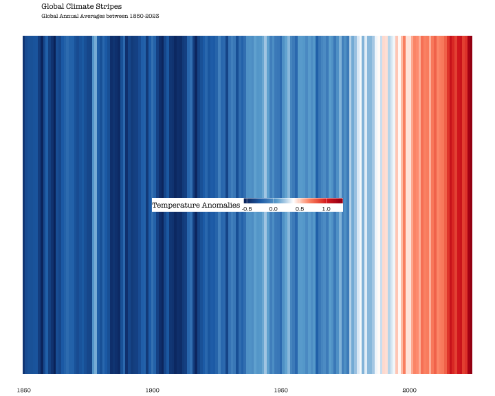
When we compare this to the global climate stripes chart (see figure below), it does appear that the Innsbruck temperature is more fluctuating — and less like a clear-cut story of climate warming. The climate stripes were first developed by climate scientist Ed Hawkins in 2018 as a way to make the trend of global warming visible at a glance - just time and color. Unlike my Innsbruck figure, which shows local June temperatures, the global stripes average yearly temperature anomalies — the deviation from a long-term global average — across locations and time periods. Each stripe represents the average anomaly of a full year, aggregated across the entire planet using both land and ocean data. It's not about local weather — it's the big picture. You can explore climate stripes of your country/continent here: https://showyourstripes.info/ .
It is simply a statistical fact: The more we aggregate and average, the smoother the trend. Local extremes — like a sudden cold June or an unusually hot spring — get balanced out. What remains is the long-term signal, stripped of short-term noise, and that signal shows a clear and persistent rise in global temperatures.
Longer, Hotter, and Harder to Ignore: What Disaggregated Data Still Reveals
When we stop smoothing and start zooming in — year by year, place by place — we expect noise. And yes, the data gets bumpier. Local weather is messy. Cold snaps still happen. But if we look closely, a powerful pattern emerges.
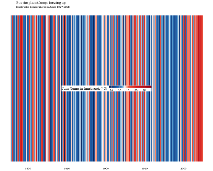
The chart below shows Innsbruck’s June temperatures compared to the 1961–1990 average. Each bar represents one year. Cold Junes dip into blue. Hot Junes rise into red. The shift is striking: over time, heatwaves become longer, more intense, and harder to ignore. The cold years haven’t vanished, but they’ve thinned out, and the balance has tipped unmistakably toward heat.
This isn’t global averaging. It’s not a smoothed curve. It’s raw, local, year-by-year data. And yet — it still tells the same story: the climate is warming. Not just in theory. Right here, right now.
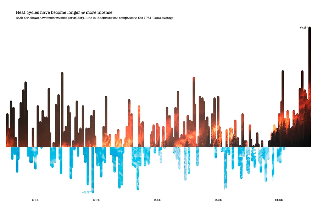
Global warming is a fact. And it’s not just a global one — it’s right there, in your local town, your city, your neighborhood. Yes, there have always been natural cycles of warmth and cold. But what we’re seeing now isn’t just another swing of the pendulum. The heat cycles are getting longer, more intense, and more frequent — even when you zoom in on just one month in just one place. These aren’t distant warnings. They’re patterns unfolding in our own backyards. And the more we look, the clearer they become.
All visuals and text in this blog post were created by Lisa Lechner. The following scientific publications were used to support the analysis.
Bibliography:
Hawkins, E., Williams, R. G., Young, P. J., Berardelli, J., Burgess, S. N., Highwood, E., Randel, W., Roussenov, V., Smith, D., & Placky, B. W. (2025). Warming stripes spark climate conversations: From the ocean to the stratosphere. Bulletin of the American Meteorological Society, 106(5), E964–E970. https://doi.org/10.1175/BAMS-D-24-0212.1
Rohde, R. A., & Hausfather, Z. (2020).
The Berkeley Earth Land/Ocean Temperature Record. Earth System Science Data, 12, 3469–3479.
https://doi.org/10.5194/essd-12-3469-2020